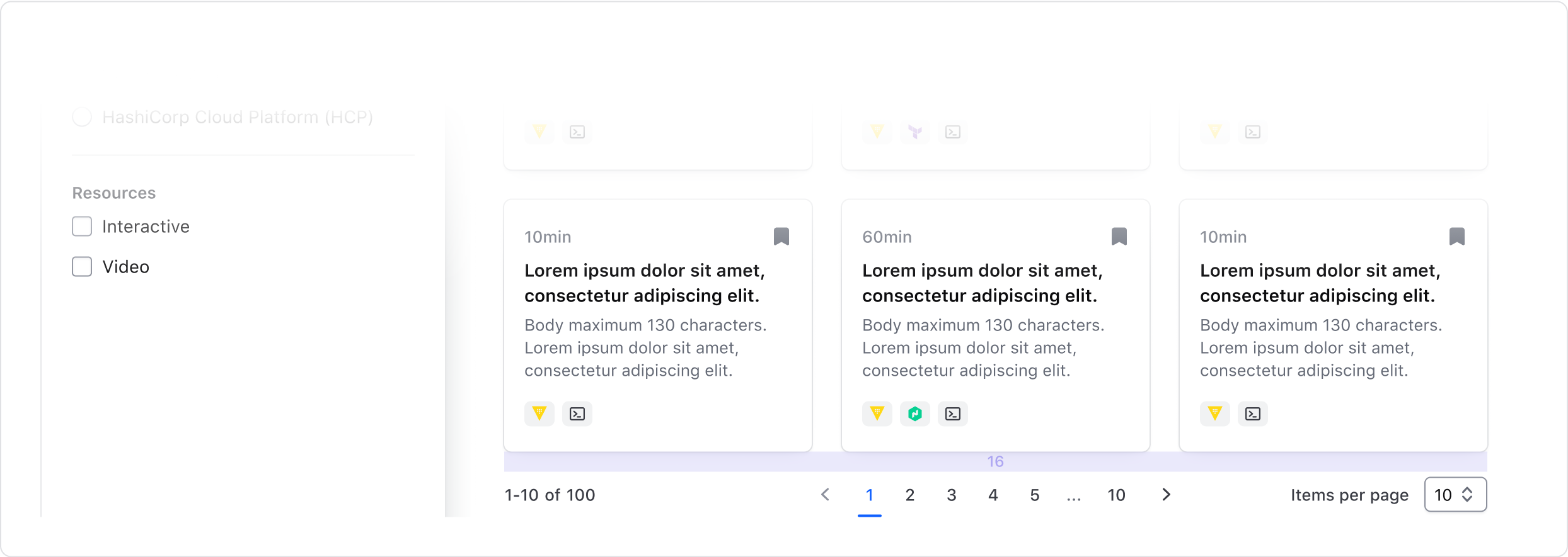
Use Pagination to let users navigate through content broken down into pages. Usually paired with tables, but works with other types of page content.
Usage
When to use
- To break down large content into pages. Usually paired with tables, but works with other types of page content.
When not to use
- As a navigation control for a flow or to pair with a stepper, i.e. for a guide, tutorial, or setup flow.
- As a controller to switch between multiple views. Use Tabs instead.
Numbered vs Compact
Cursor and offset are the most common types of pagination. Currently, most HashiCorp products use cursor-based navigation.
Cursor navigation allows users to navigate to the next or previous set of records no matter where the user is located within the dataset (record 1 or 300). With this type of pagination, the system doesn’t know which page the current page is and can’t show page numbers (1, 2, 3, etc…). If your product supports it, you should use compact pagination.
Offset or page-based pagination allows you to divide datasets into pages, letting users navigate to any particular page. If your product supports it, you can use either numbered or compact pagination. In most cases, the numbered pagination provides a better user experience. It allows users to jump between pages and always return to the first page or go to the last page without navigating through the pages manually.

- Supported by offset (page-based) pagination.

- Supported by offset and cursor based pagination.
Spacing
- When using the pagination bar, the container should be flush on the left & right with the content.
- When using the pagination, the component should be center aligned with the content it relates to.
- Make sure there’s enough distance and breathing room between the pagination and unrelated content (e.g. another section below it), so it’s clear what content the pagination is paired with.
When pairing the pagination or pagination bar with tables, we recommend:
- 16px between the pagination or pagination bar and the content it relates to.

When pairing with content which is not contained (e.g. cards, lists), we recommend:
- At least 16px for consistency. If your product uses a scale where the spacing between elements tends to be higher or lower, or the paginated content looks optically loose or tight to the component, increase or decrease the spacing accordingly.

How to use this component
{basic invocation details}
<Hds::Alert @type="inline" as |A|>
  <A.Title>Title here</A.Title>
  <A.Description>Description here</A.Description>
</Hds::Alert>
Variant/property name
{description}
<Hds::Alert @type="page" as |A|>
  <A.Title>Title here</A.Title>
  <A.Description>Description here</A.Description>
</Hds::Alert>
Component API
- Name
-
type - Type
-
enum - Required
-
Required
- Values
-
- page
- inline
- compact
- Description
- Sets the type of alert.
- Name
-
color - Type
-
enum - Values
-
- neutral (default)
- highlight
- success
- warning
- critical
- Description
-
Sets the color scheme for
background,border,title, anddescription, which cannot be overridden.colorresults in a defaulticon, which can be overridden.
- Name
-
icon - Type
-
string | false - Description
-
Override the default
iconname, which is determined by thecolorargument.
Accepts any icon name, orfalse, for no icon.
- Name
-
onDismiss - Type
-
function - Description
- The alert can be dismissed by the user. When a function is passed, the "dismiss" button is displayed.
- Name
-
…attributes - Description
-
This component supports use of
...attributes.
Showcase
Anatomy
Pagination

| Element | Usage |
|---|---|
| Info | Optional |
| Nav | Required |
| Size selector | Optional |
Pagination Nav

| Element | Usage |
|---|---|
| Prev page | Required |
| Next page | Required |
| Page number | Required for Compact, otherwise optional |
| Current page | Required |
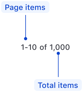
Pagination Info

| Element | Usage |
|---|---|
| Page items | Required |
| Total items | Optional |
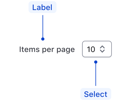
Size Selector

| Element | Usage |
|---|---|
| Label | Required |
| Select | Required |
States
Default

Selected

Conformance rating
When used as recommended, there should not be any WCAG conformance issues with this component.
Explain how the component is conditionally conformant. For example, any component that offers text truncation is conditionally conformant- it is conformant as long as the text truncation feature is not used.
The Component Name component is not WCAG-conformant on its own. (Explain how to use it in a conformant way)
Best practices
Keyboard navigation
In most cases, the numbered pagination provides a greater user experience. It allows users to jump between pages and always return to the first page or go to the last page without navigating through the pages manually.
If your product only has cursor pagination, it won’t be able to support the numbered variant. Only applications with offset pagination can implement the numbered pagination variant.
Focus and move between pagination controls.
tab

Trigger button to navigate to another page.
enter

Applicable WCAG Success Criteria
This section is for reference only. This component intends to conform to the following WCAG success criteria:
-
1.3.1
Info and Relationships (Level A):
Information, structure, and relationships conveyed through presentation can be programmatically determined or are available in text. -
1.3.2
Meaningful Sequence (Level A):
When the sequence in which content is presented affects its meaning, a correct reading sequence can be programmatically determined. -
1.4.1
Use of Color (Level A):
Color is not used as the only visual means of conveying information, indicating an action, prompting a response, or distinguishing a visual element. -
1.4.10
Reflow (Level AA):
Content can be presented without loss of information or functionality, and without requiring scrolling in two dimensions. -
1.4.11
Non-text Contrast (Level AA):
The visual presentation of the following have a contrast ratio of at least 3:1 against adjacent color(s): user interface components; graphical objects. -
1.4.12
Text Spacing (Level AA):
No loss of content or functionality occurs by setting all of the following and by changing no other style property: line height set to 1.5; spacing following paragraphs set to at least 2x the font size; letter-spacing set at least 0.12x of the font size, word spacing set to at least 0.16 times the font size. -
1.4.3
Minimum Contrast (Level AA):
The visual presentation of text and images of text has a contrast ratio of at least 4.5:1 -
2.1.1
Keyboard (Level A):
All functionality of the content is operable through a keyboard interface. -
2.1.2
No Keyboard Trap (Level A):
If keyboard focus can be moved to a component of the page using a keyboard interface, then focus can be moved away from that component using only a keyboard interface. -
2.2.1
Timing Adjustable (Level A):
If there are time limitations set by the content, one of the following should be true: turn off, adjust, extend, real-time exception, essential exception, 20 hour exception. -
2.5.3
Label in Name:
For user interface components with labels that include text or images of text, the name contains the text that is presented visually. -
4.1.1
Parsing (Level A):
In content implemented using markup languages, elements have complete start and end tags, elements are nested according to their specifications, elements do not contain duplicate attributes, and any IDs are unique. -
4.1.2
Name, Role, Value (Level A):
For all user interface components, the name and role can be programmatically determined; states, properties, and values that can be set by the user can be programmatically set; and notification of changes to these items is available to user agents, including assistive technologies. -
4.1.3
Status Messages (Level AA):
In content implemented using markup languages, status messages can be programmatically determined through role or properties such that they can be presented to the user by assistive technologies without receiving focus.
Support
If any accessibility issues have been found within this component, please let us know by submitting an issue.